
Three entry points into one patient journey.

Built independent CMS landing pages plus a guided "Jornada do Sorriso Perfeito" path.
role
Solo UX/CX designer + developer
industry
Dental / Healthcare
tools
Webflow, Figma, Lovable
status
In progress

The problem

L'Oris had a clunky, non-responsive Wix site showing little beyond an address and grand-opening photos — no specialties, no patient work. But the deeper problem was behavioral: Dra. Cristina's real complaint was that patients only reached out reactively, when something already hurt, never proactively as an investment in a "perfect smile project."

Process & Decisions

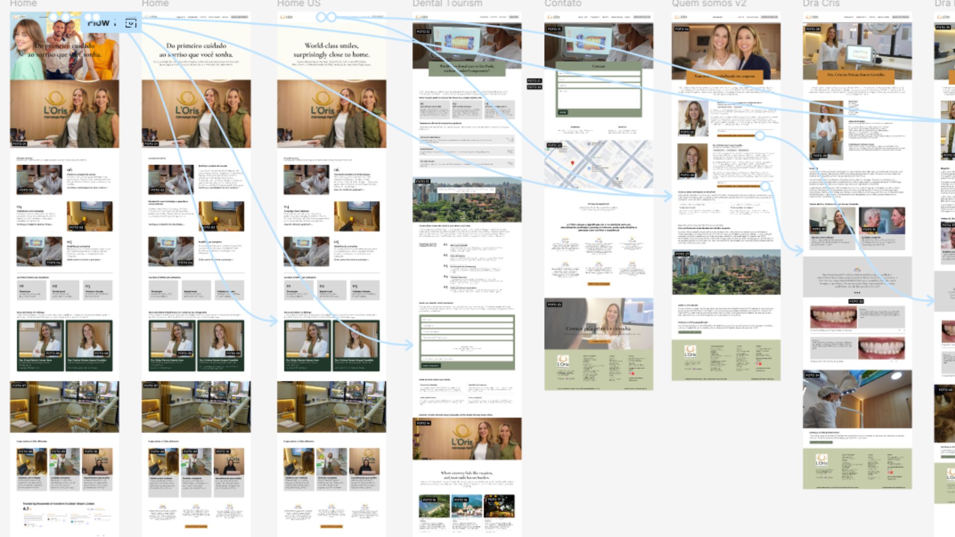
I met with both doctors in person to map what the old site was leaving on the table, ran competitive research against other digital-dentistry practices, gathered their wishlist, and presented a Figma prototype a week later so they could walk through the experience before a single line of code was written.
Key structural moves

The key architectural decision was building each specialty as an independent CMS-driven landing page rather than one flat service list. This unlocked three distinct entry points into the same content:
  • Standalone landing pages — each specialty (implants, ortho, rehab) works alone, sponsorable individually via Google Ads
  • Treatments list in the footer — for visitors who already know what they need
  • "Jornada do Sorriso Perfeito" — a guided path linking every step (from saúde bucal through odontogeriatria) so a visitor can explore proactively, treating dental care as an ongoing project rather than a one-off fix

"Most people only think about their dentist mid-toothache. We built a site with three different doors in, so a few of them start thinking about it a lot sooner."

More about Hans →
Let's talk